Uncover the Latest Paint and Color Trends Transforming Home Staging
Uncover the Latest Paint and Color Trends Transforming Home Staging - Beyond Beige - Bold Colors Making Waves in Modern Listings
For decades, beige, grey, and other neutral tones dominated home decor. These muted, subtle colors were considered safe and inoffensive for appealing to the widest range of homebuyers. However, modern trends reveal a growing appetite for bolder, more vibrant colors in home staging and design.
Rich jewel tones like emerald green and sapphire blue are storming today's most stylish listings. These dramatic colors infuse spaces with energy and luxury when used judiciously. Strategic accent walls or colorful statement furniture help bold colors make an impact without overwhelming. Staging pros advise limiting bold colors to one or two focal points. A vivid blue dining room or teal accent wall can feel inviting rather than overwhelming when balanced by neutral backdrops.
Warm, saturated colors also bring warmth and character to modern spaces. Deep reds, oranges, and yellows paired with natural wood and textures create cozy, inviting spaces. When used in entryways, dining rooms, and living spaces, these colors encourage people to linger and connect. For some buyers, beige decor feels dull or generic. Vibrant colors help staged homes feel lived-in, personal, and full of possibility.
Earthy tones like sage green, brick red, and mustard yellow are also gaining ground in staging. Linked to nature, these colors create a peaceful ambiance. Staging with earth tones and natural materials appeals to the eco-conscious buyer’s desire for tranquility and sustainability.
Finally, bright, joyful colors create energy and fun in family-friendly spaces. A playroom or child’s bedroom comes alive with colors like sunshine yellow, grass green, sky blue, and cherry red. Unexpected colors also modernize kitchens and bathrooms. A bold aqua island or rose quartz vanity breathes new life into these essential spaces.
Uncover the Latest Paint and Color Trends Transforming Home Staging - Neutral Nuances - How Subtle Color Choices Influence Buyer Perception
While vivid, saturated colors command attention, neutral and subtle hues still play an indispensable role in staging. Soft off-whites, warm greys, and pale earth tones seem innocuous at first glance. However, these quiet colors profoundly influence buyers’ emotional response and perception of a home. Though less flashy than their bold counterparts, muted neutrals have the power to create feelings of calm, comfort, spaciousness, and light according to color psychology.
Staging a home in all white or beige once seemed like a foolproof way to appeal to the masses. However, today’s neutral nuances go beyond plain white walls. Complex off-whites like almond, oat, and linen have dimension that prevents spaces from feeling sterile. Warm grey tones like dove, fog, and slate also provide a cozy, welcoming backdrop. Pairing these refined neutrals with natural textures and materials satisfies buyers’ thirst for understated sophistication.
Soft neutrals also influence buyers’ perception of space and light. Light colors reflexively feel more open and airy to viewers. Strategically painting ceilings and hallways in pale hues makes rooms appear larger. Large neutral spaces feel serene rather than cavernous. Neutral colors also optimize natural light. Whites and off-whites reflect daylight, making rooms feel sunlit and cheerful. Staging with an all-white color palette allows the home’s architecture and outdoor views to shine.
Uncover the Latest Paint and Color Trends Transforming Home Staging - The Impact of Paint Finishes on Virtual Staging Realism
The realism of virtually staged interiors depends greatly on accurately replicating not just wall colors but the light-reflecting qualities of real-world paint finishes. Matte, eggshell, satin, semi-gloss—subtle differences in paint sheen have a big impact on how durable, washable, and vivid a color appears. When properties are staged virtually, paint finish determines whether the final renderings look convincingly life-like or obviously computer-generated.
Matte and flat paints absorb light, masking imperfections but showing scuffs easily. These finishes read as soft, hazy, and muted on camera. Eggshell paint offers mild light reflection, ideal for bedrooms and dining rooms. With subtle luster, eggshell finishes photograph beautifully while hiding minor flaws. Satin paint becomes increasingly luminous. Its luxurious sheen amplifies color saturation and depth. Semi-gloss paint reflects the most light, making it shiny, vivid, andhighly washable.
Virtual staging experts must consider these finish characteristics to mimic reality. A dining room visualized in flat paint may look dull and fake next to a kitchen staged in glossy semi-gloss. Mismatched sheens break the illusion that distinct spaces coexist within one home. Lighting also interacts with paint finish. A satin accent wall spotlighted in a virtual model needs calibrated luminosity to look convincing.
Industry professionals emphasize authenticity in recreating paint sheen, texture, andcast through CGI. "It's crucial to render finishes true to life,” says Michelle Moreno, founder of Urban Spaces VR. “A matte paint that lacks depth of field or reflects too much light immediately triggers 'uncanny valley.’ But when the details are photorealistic, the brain believes the illusion.”
Besides selecting accurate sheens, staging pros recommend showcasing paint brands known for their real-world performance. “We partner with top paint companies to leverage their existing imagery and finishes,” explains Veronica Lam, CMO of BoxBrownie. “Clients recognize these details from experience, so it adds legitimacy.” Integrating familiar paint qualities that buyers can relate to makes virtual interiors more believable and relatable.
Uncover the Latest Paint and Color Trends Transforming Home Staging - Eco-Friendly Paints - A New Demand in Home Presentation
As environmental consciousness enters the mainstream, sustainable living extends beyond groceries and cars into every corner of the home. For eco-minded buyers, this includes the very paint on the walls. Non-toxic, environmentally friendly paints are the new standard for staged homes targeting green homebuyers.
Traditional paint chemicals like VOC solvents, formaldehyde, and plastic microparticles pollute the air during application and outgas over time. Off-gassing irritates respiratory systems and introduces toxic compounds into the indoor environment. In contrast, eco-friendly paints use plant-based ingredients and fewer corrosive chemicals for vastly reduced emissions. Milk-based latex, plant oils, clay, and mineral pigments create durable paints free of VOCs, formaldehyde, and plasticizers.
Staging a home with eco-paints signals alignment with buyers’ ethical values. “I exclusively use low-VOC, plastic-free paints to reflect my sustainability-focused listings,” shares Austin realtor Micah Jones. “It resonates with clients who prioritize healthy materials.” Beyond signaling virtuous intent, sustainable paints also provide practical advantages. Plant-based oils allow surfaces to breathe, reducing mold and mildew. Natural paints touch up and clean up easily compared to petroleum-based products. Milk-based finishes stand up to scrubbing and scuffing while maintaining their eco-friendly profile.
Paint companies now cater to the surge in demand for safer paint options. Major brands like Benjamin Moore offer extensive eco-friendly collections. Boutique green paint companies like Mythic, ECOS, and Giddy provide additional ethical choices. “With so many quality organic paint options now, there’s no reason not to specify these for staging,” insists interior designer Nina Ward. “It’s a huge value-add for certain demographics.”
Uncover the Latest Paint and Color Trends Transforming Home Staging - Cultural Influences Shaping Today's Home Color Trends
Our homes are a reflection of who we are and where we come from. In today's increasingly diverse society, cultural influences from around the world are shaping home color palettes and decor choices.
For many homeowners today, boldly incorporating cultural colors and motifs is a meaningful way to honor their roots. “As a daughter of immigrants, I love decorating with the rich jewel tones and intricate patterns of my South Asian heritage,” shares homeowner Priya Mehta. “While beige walls were once the norm here, I take pride in surrounding myself with the vibrant coral pinks, deep turquoises, and shimmering golds of the saris and textiles of my childhood.”
Beyond honoring family backgrounds, some homeowners are drawn to color palettes inspired by distant locales evoking wanderlust. “My home is a riad-style sanctuary, with intricate tile work and pops of sky blue, saffron, and terracotta inspired by travels to Morocco,” describes Ashley Wright, avid world traveler. For Ashley, these punchy colors enliven the home and provide an everyday escape.
Of course, cultural influences extend beyond personal heritage to broadly shared aesthetic sensibilities. In the Southwest United States, desert hues like burnt orange, ochre, and sun-faded turquoise connect to the region’s indigenous art and terrain. Along coastal regions, homes embrace misty blues, sea greens, and weathered greys that reflect life along the water’s edge. In urban lofts, the gritty reds and industrial blacks of exposed brick bring the outside cityscape in.
Looking forward, emerging color trends draw inspiration from modern art and technology. Vibrant Memphis style patterns and color blocking reflect the work of postmodern designers like Ettore Sottsass. Radiant iridescent finishes and holographic chromes connect to the sheen of screens and smartphones. In these ways, the homes of today integrate both ancestral influence and futuristic innovation.
Uncover the Latest Paint and Color Trends Transforming Home Staging - Lighting and Color - Creating the Perfect Harmony for Staged Homes
The interplay between lighting and color can make or break a home staging. When lighting and paint colors work in harmony, the ambiance transforms from flat to immersive. But when lighting fights against wall hues, spaces feel visually jarring and rooms shrink. Staging pros emphasize analyzing light conditions before finalizing a color scheme. They tweak bulb temperature, fixtures, and paint colors in tandem until the palette feels cohesive.
“You really have to consider the lighting context holistically when designing a staged space,” says interior designer Jenna Lyons. “A cool-toned gray that looks chic and moody in the evening can read totally flat and gloomy in daylight.” Jenna opts to layer lighting—combining warm fixtures against cooler architectural elements—to allow colors to shift alluringly throughout the day.
Interior stylist Megan Weaver also weighs lighting conditions when planning paint colors for an open house. “I'll often opt for a warm, enveloping color palette that offsets harsh daylight from large windows,” Megan explains. “Strategic task lighting also helps create cozy zones within more expansive rooms.”
Color consultant Kate Smith notes small changes in lighting temperature make a surprising difference. “Just switching out cool 5000K bulbs for softer 2700K versions can make beige walls glow instead of looking bland and clinical," Kate shares. She says small tweaks to paint colors also create dramatic shifts. "Going just slightly warmer or cooler on the undertone changes the feeling entirely."
Technical advancements in LED bulbs grant staging pros nuanced control over light color. Instead of harsh fluorescent lighting, LEDs allow subtle customization of color temperature. Along with smart bulbs, technologies like Lutron systems enable remote control of lighting scenes. With programmed light settings, stagers sculpt light to complement paint colors any time of day.
Uncover the Latest Paint and Color Trends Transforming Home Staging - From Walls to Decor - Integrating Trend Colors Throughout the Home
Beyond just painting walls, today's most compelling staged homes integrate colors throughout all decorative details. From furniture to accents, art to textiles, continuity of color creates visual harmony and interest. Rather than treating rooms as disparate boxes, a cohesive color story connects the home into a holistic experience.
"I like to develop a core color palette that informs not just wall paint, but fabrics, rugs, and accessories," explains designer Nina Winston. "In the living room, I'll pull in splashes of that bold cobalt blue from an accent wall into the draperies, pillows, and books. It makes the color feel intentional." Nina advises sticking to three or four core hues for a room to keep the look curated.
Creative stagers play with tone and saturation to make one color feel fresh in varied applications. "In a child's room, I painted the walls a pale blue then incorporated it into bedding in a deeper navy, plus accents in a vibrant turquoise," says stager Michelle Lopez. This variation in shades of blue keeps the room from feeling one-note.
Repeated metallic accents also create cohesion and luxury. Stager Jennifer Kim uses metallic silver finishes in framing, vases, table bases, and throw pillows to complement cool grey walls. "Metallics make neutrals feel special and give warmth against modern colors," shares Jennifer.
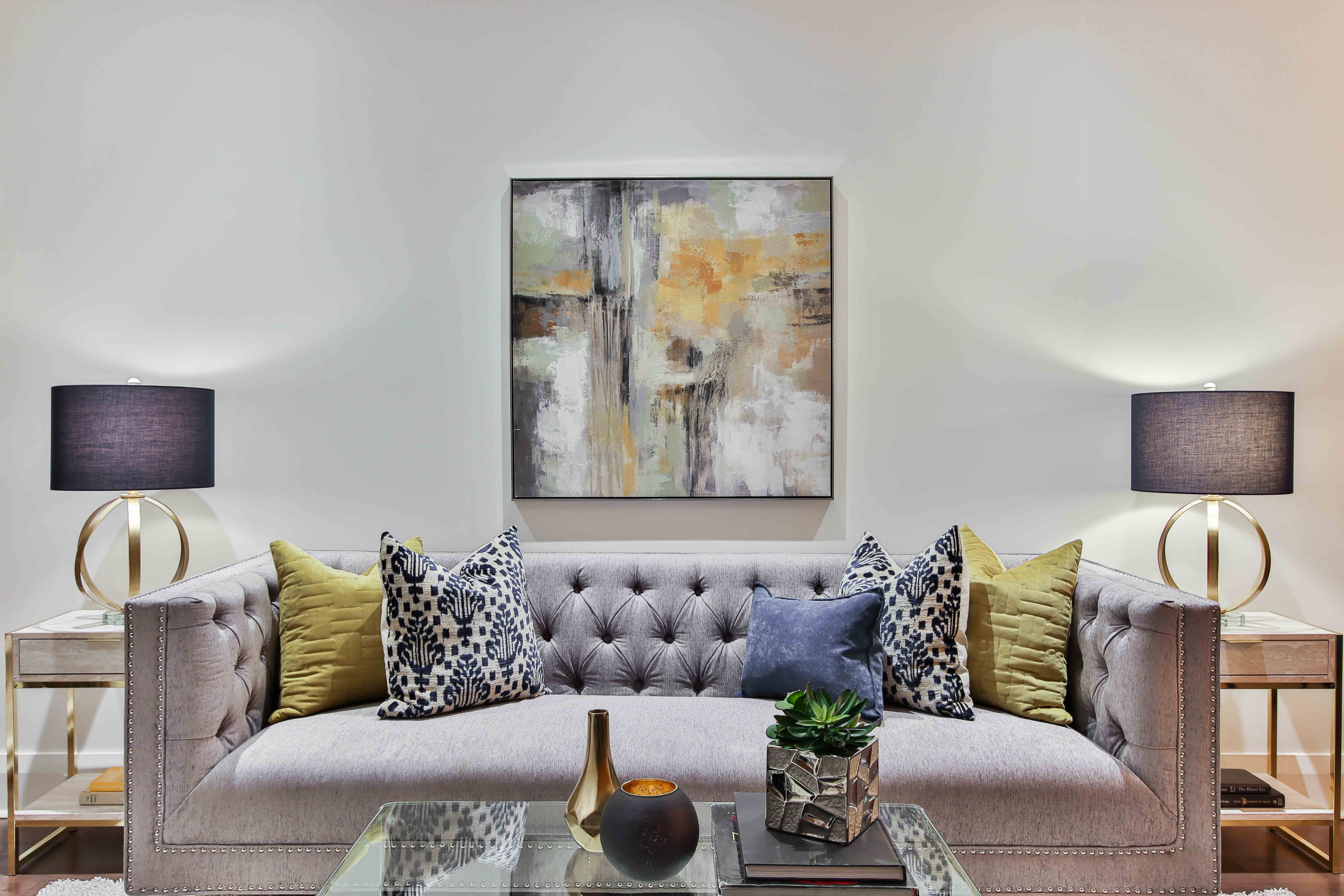
Beyond color repetition, stagers use analogous and complementary schemes across decor. Homeowner Priya Patel anchored her living room with pumpkin walls and a coordinating burnt orange sofa. She then incorporated accents in terracotta, mustard, olive, and cream for vibrancy. For contrast, emerald green velvet pillows and jade green glassware provide striking yet harmonious pops.
Interior stylist Daniel Cho takes a complementary approach in bold bedrooms. He offsets vivid accent walls in fuchsia or citron with bedding and accents blending sage greens, corals, and gold. "Vibrant complements keep the drama high but livable," Daniel explains. He merges the palettes with layered rugs and globally inspired patterns.
To make a color scheme feel natural, stagers recommend blending paint with organic textures and materials. "I'll mix cool grays with slate floors, sheepskin throws, and earthenware pots," says designer Emma Fields. Natural wood furniture also warms up modern colors. Stager Amy Wu paired slate blue walls with rattan chairs, woven poufs, and reclaimed wood shelving to prevent a "dentist office" feel.
More Posts from colossis.io: