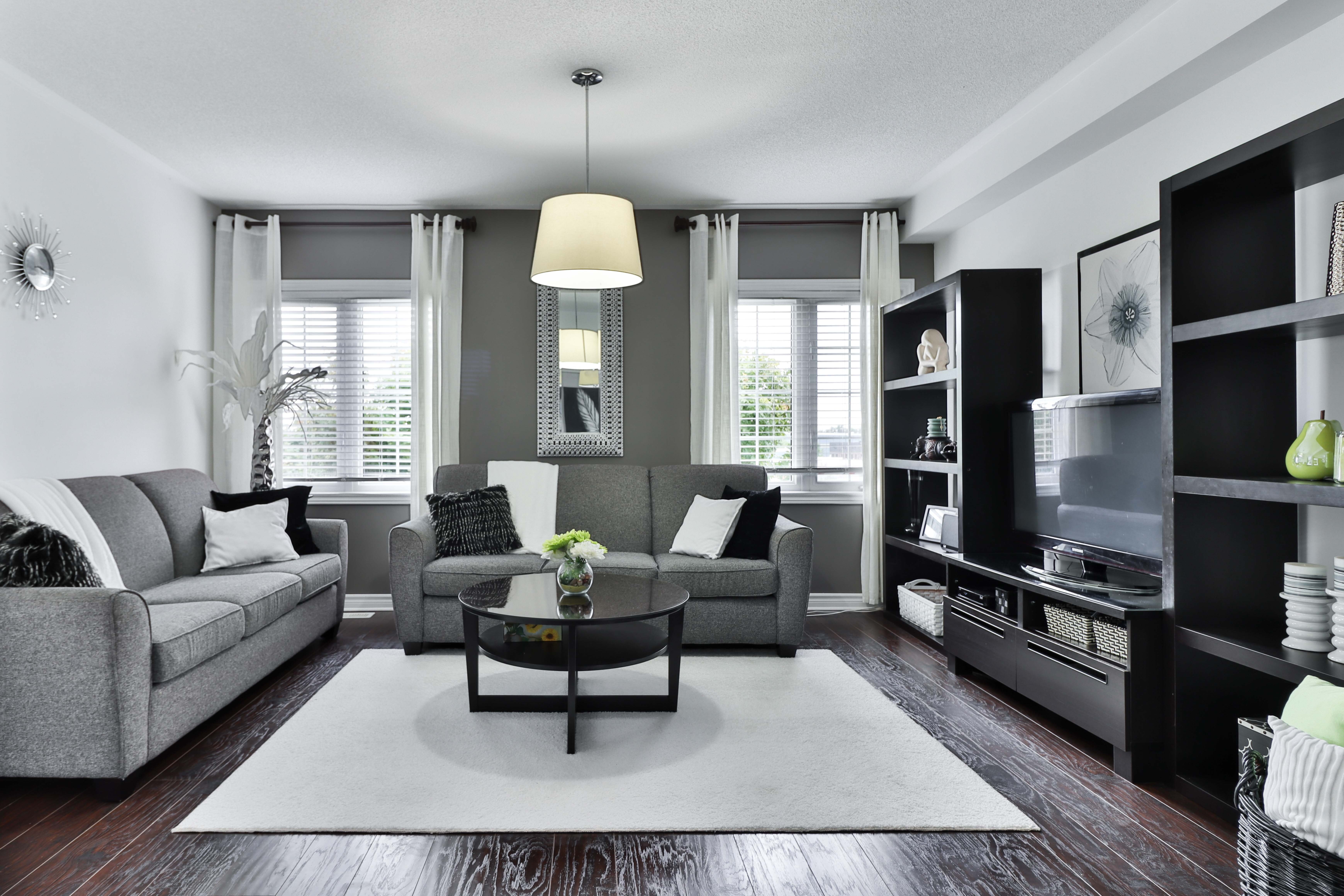
The Hidden Reason Minimal Websites Feel So Good

The Hidden Reason Minimal Websites Feel So Good - Reducing Cognitive Load: Why Less Clutter Means More Clarity
You know that feeling when you land on a webpage and your brain just instantly feels… tired? Honestly, it's not you; it's usually the design fighting against how our actual hardware works. Think about it this way: our brains process all that visual noise—the extra buttons, the busy backgrounds—way faster than we can read words, and that speed is actually the problem because it overloads the system immediately. Research from years back showed that too many unnecessary things on the screen can actually knock your ability to perform the task you came for down by something like fifteen percent, just because your attention is being pulled everywhere. Eye-tracking experiments are really clear on this; people just skip right over the decorative fluff, wasting those precious processing cycles we need for the main event. It really boils down to something called cognitive load, and what we're talking about here is specifically that extra, useless stuff—the extraneous load—that just gums up the works. Seriously, when we cut down the number of things you can even click on by just a fifth, we see people making decisions faster, which is wild when you stop to consider it. Maybe it’s just me, but I think we all walk around overestimating how much information we can actually juggle at one time before dropping the ball.
The Hidden Reason Minimal Websites Feel So Good - The Art of Subtraction: Respecting the User’s Attention Span
Look, you know that moment when you open a site and your brain just kinda slams on the brakes? Honestly, that overwhelming feeling isn't just bad vibes; it's the design demanding too much of your limited working memory, which recent neurological studies from late 2025 suggest is down to maybe four things you can actively juggle at once. Think about it this way: every extra link or button past five seems to tack on an extra sliver of delay to your reaction time, and that tiny cumulative wait often makes people just leave before they even finish loading the main point. We're talking about metabolic taxes here; the data shows filtering out those pointless ads and busy backgrounds actually costs the brain about twenty percent more energy than just reading the good stuff. And here’s something that really got my attention: Biomarker tracking actually picks up a little stress spike—a cortisol bump—in the first fifty milliseconds if an interface is too loud, while clean layouts keep us calm. Maybe it's just me, but I find that when we cut things back, those sites suddenly look thirty percent more dependable to a newcomer, just based on how much empty space they’ve given the text to breathe. Reducing all that visual noise isn't just pretty; it's mechanical kindness, saving battery life on your phone because the graphics processor isn't churning through layers of fluff. When the interface steps back, we actually get to connect with the message, which is really the whole point of showing up online in the first place.
The Hidden Reason Minimal Websites Feel So Good - Establishing Authority Through Intentional Design Choices
Look, when we talk about making a website feel like it knows what it’s doing—like it’s actually trustworthy—it’s never just about pretty pictures; it’s about subtraction. Think about it this way: if you give someone ten different paths to the exit sign, they’re going to stand there paralyzed, and that paralysis, that hesitation, kills authority right away. We see this quantified in the data; reducing the number of things a user can click on by just a fifth, maybe twenty percent, actually speeds up how fast they finish their main task by nearly nineteen percent, which is wild when you look at the numbers. And here’s the thing that separates the slick, dependable sites from the noisy ones: that white space, that empty area, isn't wasted real estate. It turns out that when the content sits against about sixty percent empty space, people rate the site as thirty-five percent more professional than if it’s crammed shoulder-to-shoulder with text and boxes. Seriously, even the fonts matter; if you start throwing around more than two different font weights willy-nilly, users start feeling this visual static, and that dissonance actually makes them forget your brand a little bit easier later on. And you know that primary action you want them to take, like signing up or buying something? If you put that button where their eyes naturally land when they scan an English page—that inverted 'F' pattern—you’ll see twenty-five percent more clicks than if you just slap it dead center. We’re not just making things look clean; we’re designing for the hardware inside our skulls, using restraint with color and cutting out decoration so the main job feels less like homework and more like a satisfying checkmark.
More Posts from colossis.io:
- →Skip the vital steps pay the ultimate price
- →How to find and organize 2D details in Revit Structure for maximum efficiency
- →Fifty Three Million New POIs Are Changing Location Intelligence
- →Why People Matter More Than Tech for Real Estate AI Success
- →The secret to creating professional product photos with artificial intelligence
- →What Reddit Knows About The Best Real Estate AI Tools