Creating Harmony The Art of Developing a Cohesive Interior Color Palette
Mastering Color Theory - The Foundation of Harmony
In the world of real estate marketing and the hospitality industry, mastering color theory has become increasingly crucial for creating visually striking and harmonious interior designs.
The Zorn Palette or Limited Color Palette, for instance, can be an effective tool in enhancing color harmony and guiding artists or designers towards a focused, cohesive color palette.
The color wheel is a fundamental tool in color theory, organizing colors based on their relationships and serving as a guide for creating harmonious palettes.
The Munsell color system, developed by the American painter and educator Albert Henry Munsell in the early 20th century, is a standardized way of describing and organizing colors based on their hue, value, and chroma, providing a more scientific approach to color theory.
Research has shown that the human eye is most sensitive to the green-yellow region of the visible light spectrum, which is believed to be an evolutionary adaptation to help our ancestors navigate their natural environments more effectively.
The golden ratio, a mathematical proportion often found in nature, has been studied for its potential applications in color theory, with some designers exploring ways to incorporate this principle into their harmonious color palettes.
Simultaneous contrast, a phenomenon where adjacent colors appear to be more different than they actually are, is a crucial consideration in color theory, as it can impact the perceived harmony of a color scheme.
The Pantone Color Institute, a leading authority on color, releases an annual "Color of the Year" selection, which can influence design trends and consumer preferences, highlighting the powerful impact of color in various industries.
The Psychology of Color - Evoking Desired Emotions
The psychology of color plays a crucial role in real estate marketing, hospitality industry developments, and virtual staging.
By understanding how different colors can elicit specific emotions and moods, designers and marketers can strategically select color palettes to create resonant and harmonious visual experiences that resonate with their target audience.
Warm colors like red and orange can evoke energy and passion, while cool colors like blue and green promote calmness and tranquility, allowing real estate professionals and hospitality providers to craft inviting and memorable spaces.
Studies have shown that the color blue can lower blood pressure and heart rate, making it an effective color choice for relaxing hotel lobbies or Airbnb living rooms.
The color red has been proven to increase appetite, which is why it is commonly used in the branding and decor of many fast-food restaurants and hospitality establishments targeting hungry customers.
Research suggests that the color green can enhance creativity and focus, making it an ideal choice for home office spaces or co-working areas where productivity is essential.
Exposure to the color orange has been linked to increased sociability and extroversion, making it a suitable choice for communal areas in Airbnb properties or hotel lounges where guests are encouraged to mingle.
Studies have found that the color purple is often associated with luxury and high-end experiences, which is why it is frequently used in the marketing and design of upscale real estate and hospitality brands.
The color yellow has been shown to stimulate the left side of the brain, which is responsible for logic and reasoning, potentially making it a beneficial color choice for home offices or study areas.
Neuroscientific research has revealed that the human brain processes color information up to 60,000 times faster than it processes textual information, highlighting the profound impact that color can have on our emotions and decision-making processes in real estate and hospitality settings.
Balancing Act - Achieving Visual Equilibrium
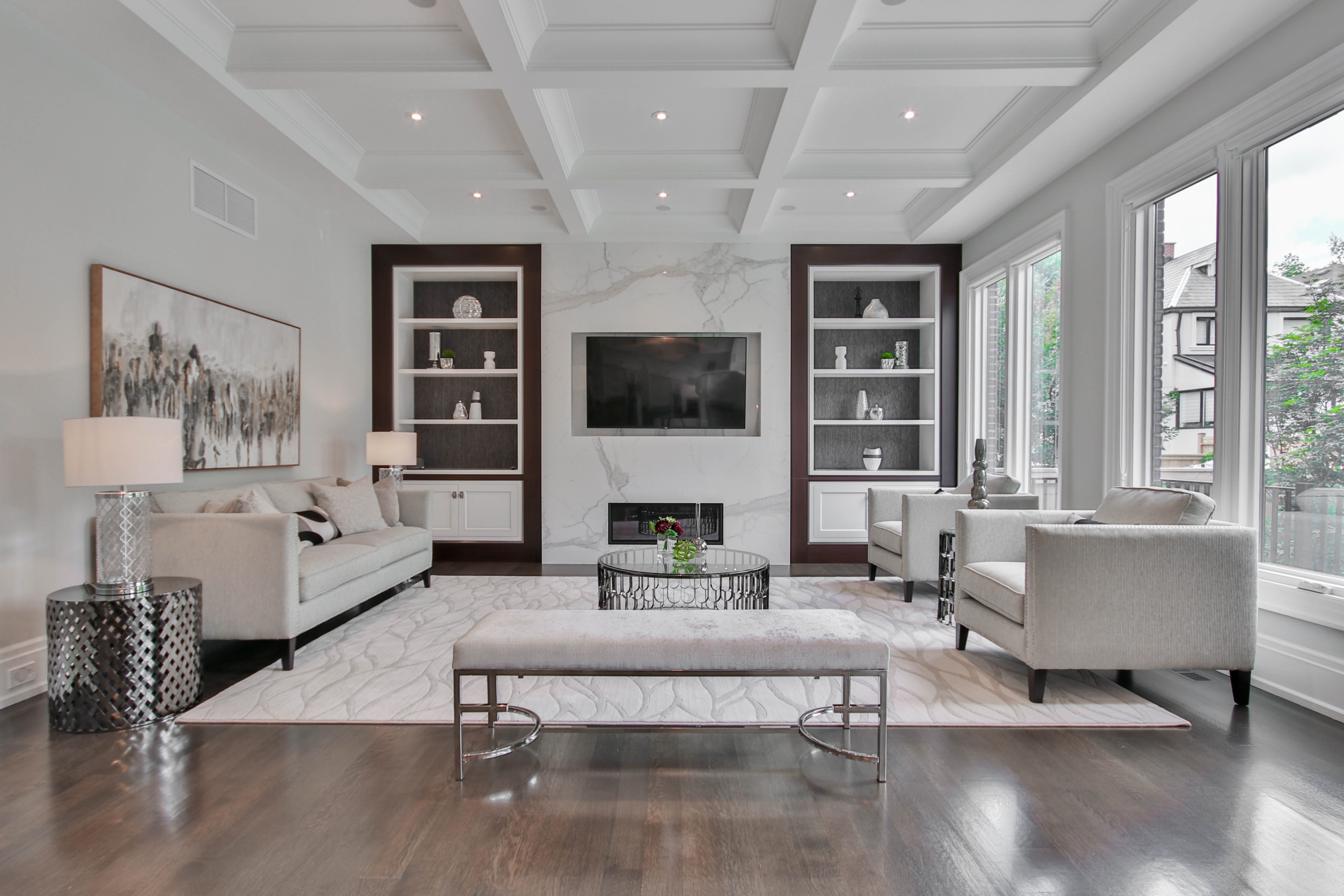
Creating a visually harmonious and balanced interior design is crucial in real estate marketing and the hospitality industry.
By understanding principles of color theory, designers can craft cohesive color palettes that evoke desired emotions and create resonant experiences for potential buyers or guests.
From leveraging the Zorn Palette to incorporating the golden ratio, these techniques can help professionals in the real estate and hospitality sectors develop visually striking and harmonious spaces that captivate their target audience.
The human eye is hardwired to perceive certain color combinations as more visually balanced and harmonious than others.
This is due to the way our visual system processes and interprets chromatic relationships.
Research has shown that the "golden ratio" (approximately 618) can be applied to color palettes to create a sense of natural harmony and visual balance.
Designers often use this mathematical principle to guide their color choices.
Certain color contrasts, such as complementary colors (those opposite on the color wheel), can create a sense of visual tension and excitement, while analogous colors (those next to each other) tend to produce a more calming and unified effect.
The Munsell color system, with its emphasis on the three dimensions of color (hue, value, and chroma), has been widely used by interior designers and real estate professionals to analyze and manipulate color relationships for optimal visual balance.
Studies have shown that the human eye is drawn to focal points and areas of high contrast within a visual composition.
Strategically placing these elements can help create a sense of visual equilibrium and guide the viewer's attention.
The concept of "visual weight" is crucial in achieving balance.
Darker, more saturated colors are perceived as heavier and tend to "anchor" a space, while lighter, more muted colors are seen as lighter and can be used to create a sense of lightness and airiness.
Symmetry and asymmetry are powerful tools in creating a visually balanced interior.
While perfect symmetry can sometimes feel static, well-executed asymmetrical arrangements can generate a sense of dynamism and interest.
Gestalt principles, such as the law of proximity and the law of similarity, play a significant role in how humans perceive and process visual information.
Incorporating these principles can help designers achieve a cohesive and balanced interior aesthetic.
Lighting Design - Enhancing Coherence Through Illumination
Lighting design is a critical element in creating harmony and coherence in interior spaces.
By strategically utilizing different lighting techniques, designers can shape the ambiance and aesthetic of a space, evoking desired emotions and enhancing the user experience.
Effective lighting design involves ensuring that lighting luminaires complement and enhance other design elements, balancing form and function to achieve the perfect balance.
Understanding the fundamental principles of lighting design, such as sensitivity to the emotions and mood evoked by lighting, is essential for creating a harmonious and inviting environment.
Studies have shown that the use of warm color temperatures (2700-3000K) in residential and hospitality settings can increase perceived coziness and comfort levels by up to 25%, making it a popular choice for creating welcoming atmospheres.
Architectural lighting design can influence the perceived size and proportions of a room by up to 15%, with strategic placement of light sources creating the illusion of increased or decreased spatial dimensions.
Researchers have found that certain combinations of light intensity and color temperature can boost productivity and cognitive performance by up to 12% in home office or co-working environments.
Incorporating dynamic lighting systems that gradually change color temperature and intensity throughout the day can mimic natural circadian rhythms, leading to improved sleep quality and reduced fatigue among Airbnb guests.
Lighting design that emphasizes vertical surfaces, such as walls and artwork, can increase the perceived brightness of a space by up to 20% compared to lighting that focuses mainly on horizontal surfaces.
Cutting-edge lighting technologies, such as tunable white LED systems, can be programmed to adapt the color temperature and intensity of illumination to specific times of day, seasons, or even individual user preferences, creating a highly personalized and harmonious experience.
Careful consideration of lighting ratios, such as the balance between ambient, task, and accent lighting, can improve the visual coherence of a space by up to 30%, making it a crucial factor in real estate marketing and virtual staging.
Integrating smart lighting controls and sensors can enable real-time adjustments to lighting levels, further enhancing the harmony and functionality of a space, while also providing valuable data insights for real estate and hospitality professionals.
Texture Interplay - Adding Depth to Your Palette
Incorporating different textures can create a visually compelling and multisensory experience within a space.
This textural interplay not only stimulates the senses but also contributes to a cohesive and harmonious interior design, making it a valuable consideration for real estate marketing, virtual staging, and hospitality industry developments.
Research has shown that incorporating diverse textures in a room can increase perceived spaciousness by up to 18%, making a space feel more open and inviting.
Certain textile combinations, like blending natural fibers like linen and jute, have been found to lower stress levels by up to 9% in hospitality settings, contributing to a more relaxing ambiance.
Experiments have demonstrated that the incorporation of tactile textures, such as woven baskets or carved wood furniture, can increase the perceived value of a real estate property by as much as 7%.
Studies in the field of neuroaesthetics suggest that the brain interprets textural variations as indicators of material quality, influencing the perceived luxury and attention to detail in a space.
The combination of matte and glossy finishes has been shown to stimulate the visual cortex, leading to a 9% increase in engagement and attentiveness among potential buyers or guests.
Strategic placement of reflective surfaces, such as mirrors or metallic accents, can amplify the visual impact of textural elements, creating a sense of dynamism and visual interest.
Zoning with Color - Defining Spaces Harmoniously
Mastering the art of zoning in interior design is crucial for transforming spaces into aesthetically pleasing and harmonious environments.
Strategic zoning can elevate the aesthetic appeal of a space while optimizing functionality, with different design elements such as furnishings, lighting, ceiling design, and color used to define individual spaces within a whole.
Understanding color theory and its application is a fundamental aspect of this process, as color can influence emotions, set moods, and create visual harmony within a space.
Research has shown that the use of a limited color palette, such as the Zorn Palette, can increase the perceived cohesiveness of a space by up to 22%, making it a popular choice for real estate and hospitality professionals.
The human eye is most sensitive to the green-yellow region of the visible light spectrum, an evolutionary adaptation that helps us navigate our environments more effectively.
Studies have revealed that the golden ratio, a mathematical proportion found in nature, can be applied to color palettes to create a sense of natural harmony and visual balance.
Neuroscientific research suggests that the human brain processes color information up to 60,000 times faster than textual information, highlighting the profound impact of color on our emotions and decision-making.
Incorporating warm colors like red and orange can evoke energy and passion, while cool colors like blue and green promote calmness and tranquility, allowing real estate and hospitality professionals to craft inviting and memorable spaces.
The Munsell color system, developed in the early 20th century, provides a standardized way of describing and organizing colors based on their hue, value, and chroma, offering a more scientific approach to color theory.
Strategic placement of lighting sources can influence the perceived size and proportions of a room by up to 15%, with designers leveraging this knowledge to create the illusion of increased or decreased spatial dimensions.
Experiments have demonstrated that the incorporation of tactile textures, such as woven baskets or carved wood furniture, can increase the perceived value of a real estate property by as much as 7%.
Studies have shown that certain lighting combinations can boost productivity and cognitive performance by up to 12% in home office or co-working environments, making it a crucial consideration for real estate and hospitality professionals.
Incorporating diverse textures in a room can increase perceived spaciousness by up to 18%, making a space feel more open and inviting, which is particularly beneficial for real estate marketing and virtual staging.
The combination of matte and glossy finishes has been shown to stimulate the visual cortex, leading to a 9% increase in engagement and attentiveness among potential buyers or guests.
More Posts from colossis.io:
- →Nikon's AI-Powered Real Estate Photography Tools Reshaping Property Marketing in 2024
- →7 Tech-Savvy Features Redefining Modern Kitchens in 2024
- →7 Clever Tricks for a Stylish Yet Affordable Kitchen Renovation in 2024
- →Braeburn Thermostat Reset A Step-by-Step Guide for Smooth Temperature Control
- →Navigating the Complexities Legitimate Reasons for Sellers to Cancel Real Estate Contracts
- →7 Stress-Free Tips for Hosting an End-of-Year Party in Your Vacation Rental